
Hey! Thanks for popping by my blog. 🙂
First, I just wanted to give a shout out to a good friend of mine, Chris Blakeley. He’s a photographer and took this shot. He is crazy talented, and you can check out his work here.
I was looking for inspiration and I saw this picture of his the other day and it got me thinking about what I wanted to write about. If your website is not “responsive” it is past its prime. It’s Expired. We’re talking beyond pining for the Fjords here. And that’s not just my opinion. Google thinks so too. Soon Google (and I’m guessing the other search engines will follow suit) will drop the rankings of the sites that aren’t mobile/different device friendly.
The straight up definition of responsive is the following:
re·spon·sive (as defined by the google machine)
rəˈspänsiv/
adjective
synonyms: quick to react to,reactive to,receptive to,open to suggestions about,amenable to,flexible to,sensitive to,sympathetic to;
aware of “several consumers said the company hadn’t been responsive to their needs”
Responsive is just a great way to be in business (and life!), in my opinion. You want to be nimble and adaptive to all kinds of situations and customers. But this definition doesn’t really explain what this has to do with the construction and mechanics of your website. Which is extremely important information to keep you relevant, showing up on search engines, and all around better experience for your customers.
“So what the filly heck is a responsive website anyway? What does it mean?”, you may be asking.
Wikipedia sums it up with this:
Responsive web design (RWD) is an approach to web design aimed at crafting sites to provide an optimal viewing and interaction experience—easy reading and navigation with a minimum of resizing, panning, and scrolling—across a wide range of devices (from desktop computer monitors to mobile phones).
So whatever the device your site is being viewed on, your site looks good. Cell? Tablet? Laptop or Desktop? Your site should look good on all of these things. I’m sure you’ve experience the frustration of trying to navigate a site on your phone that you have to pinch to get it close, then things are difficult to click on… it’s a pain. You don’t want your clients to have that kind of good time on your site. It says you’re old school, and not in a cool, retro way.
I could bore you with how media queries work, and all that good stuff, but my mother is already probably reading this in the Charlie Brown teacher voice, so I’ll skip to the visual.
I design all my sites to be responsive. When you look at my portfolio, you can see I present the website on different devices, like magnolia grove below:
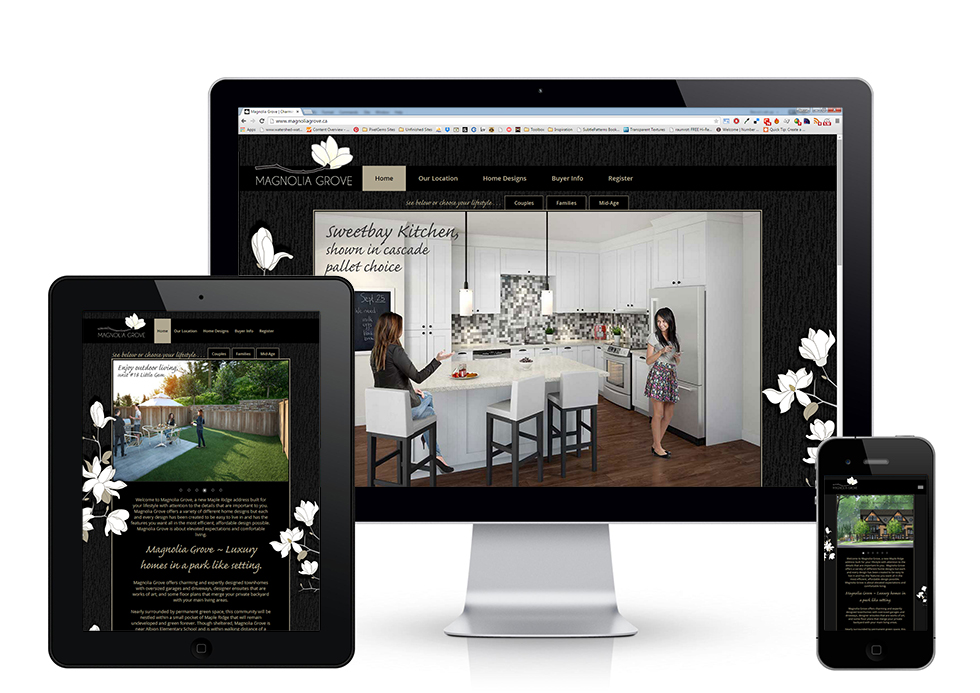
The site fits each device – no pinching or weird scrolling necessary. If your website is a few years old there is a very good chance it is not responsive.
Is your website fully responsive? Email me for a free consultation!